
27 Oct, 2024 — Donita Kadharusman
Principles of Games Art 24/25
2D — Concept Art, Week 2
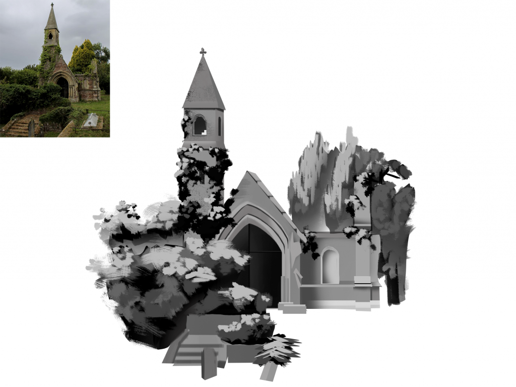
Value Study
(Opening Photoshop for the first time scared me, but I eventually got used to it)
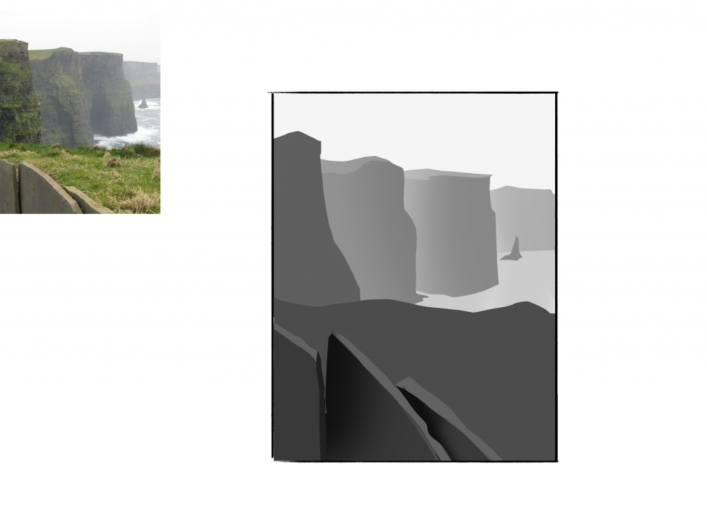
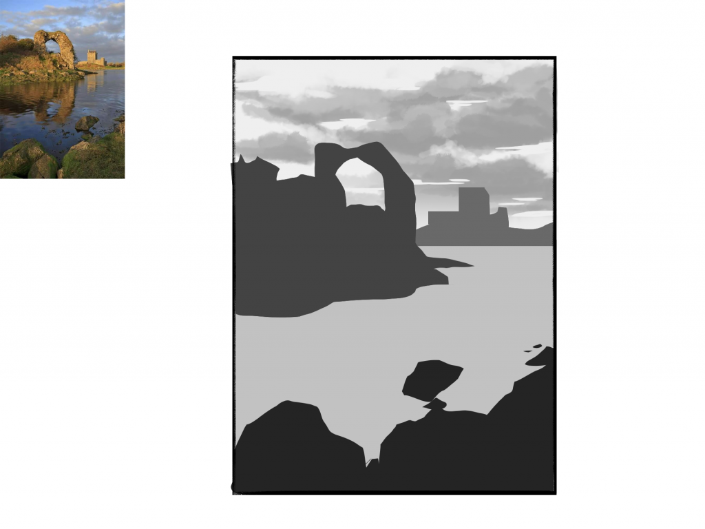
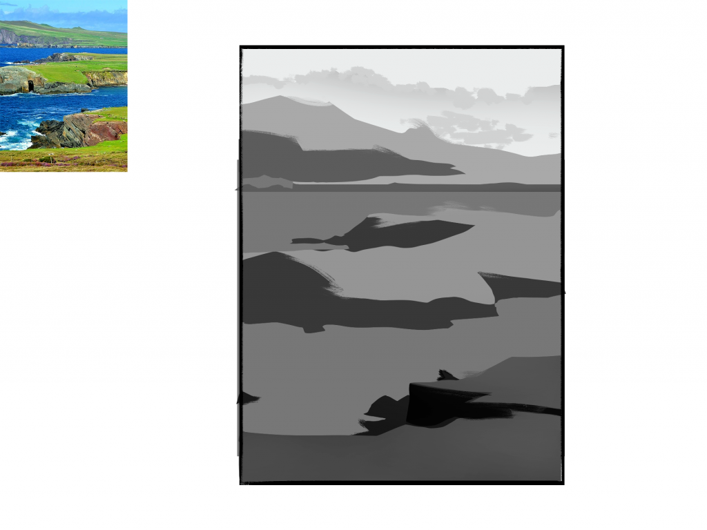
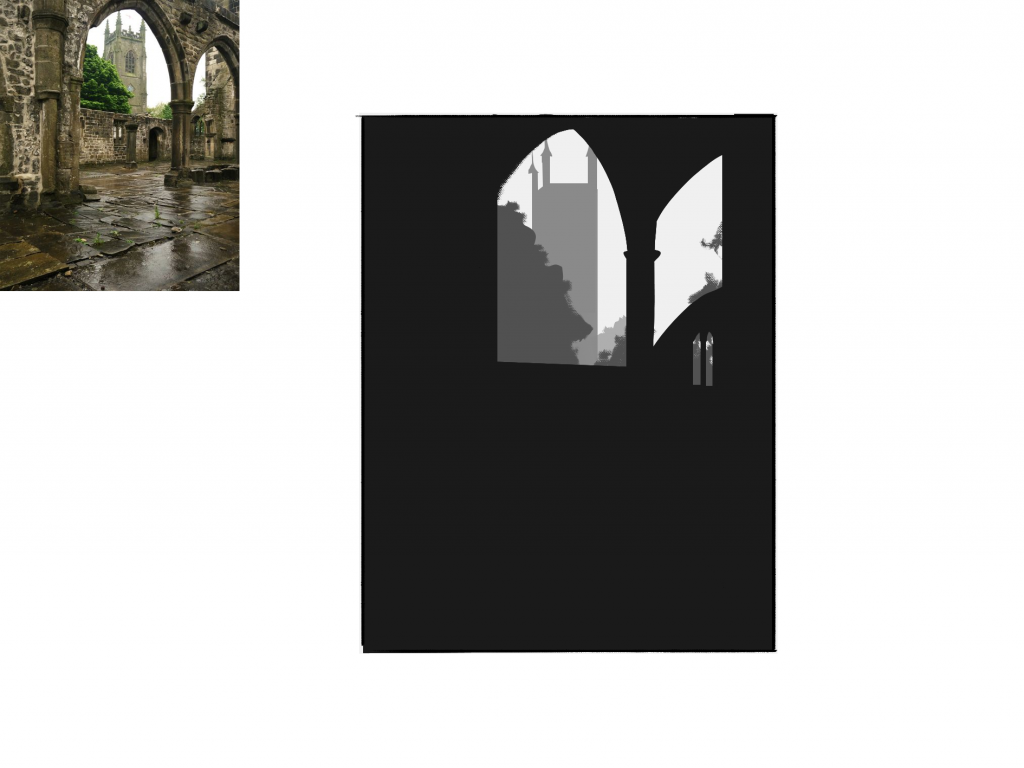
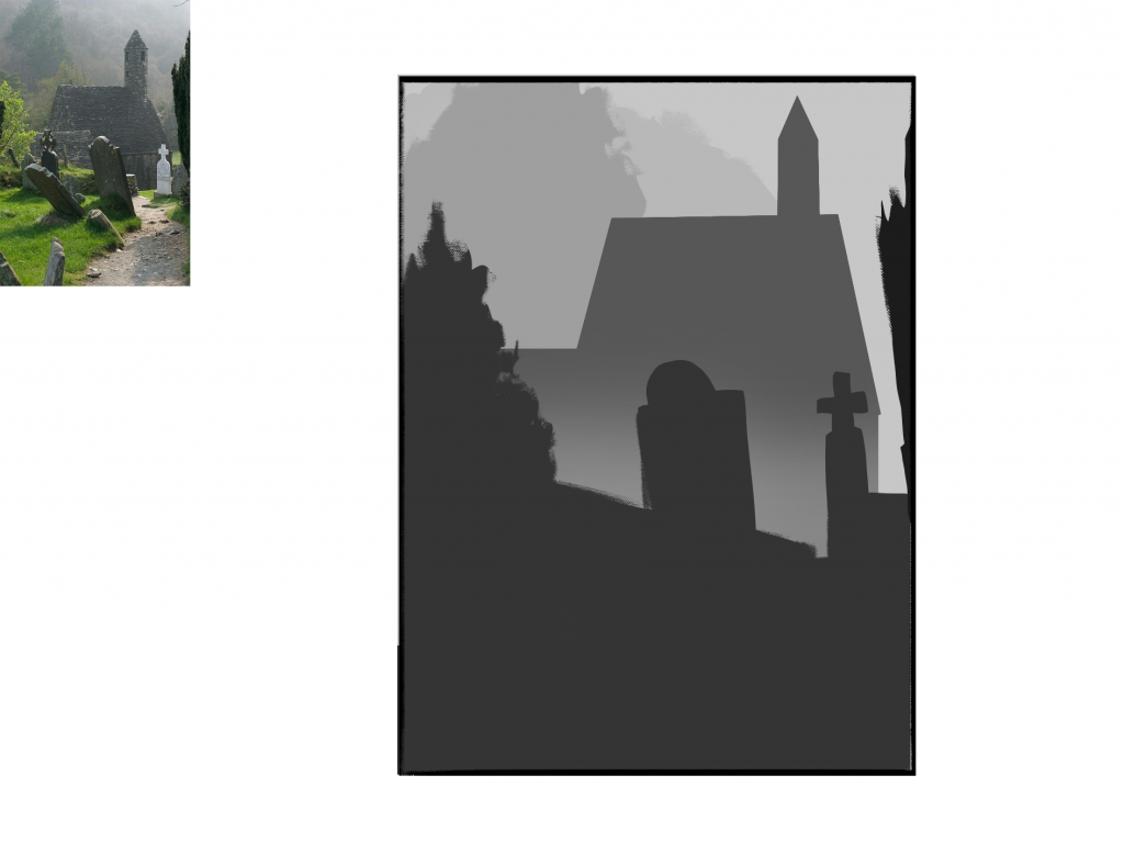
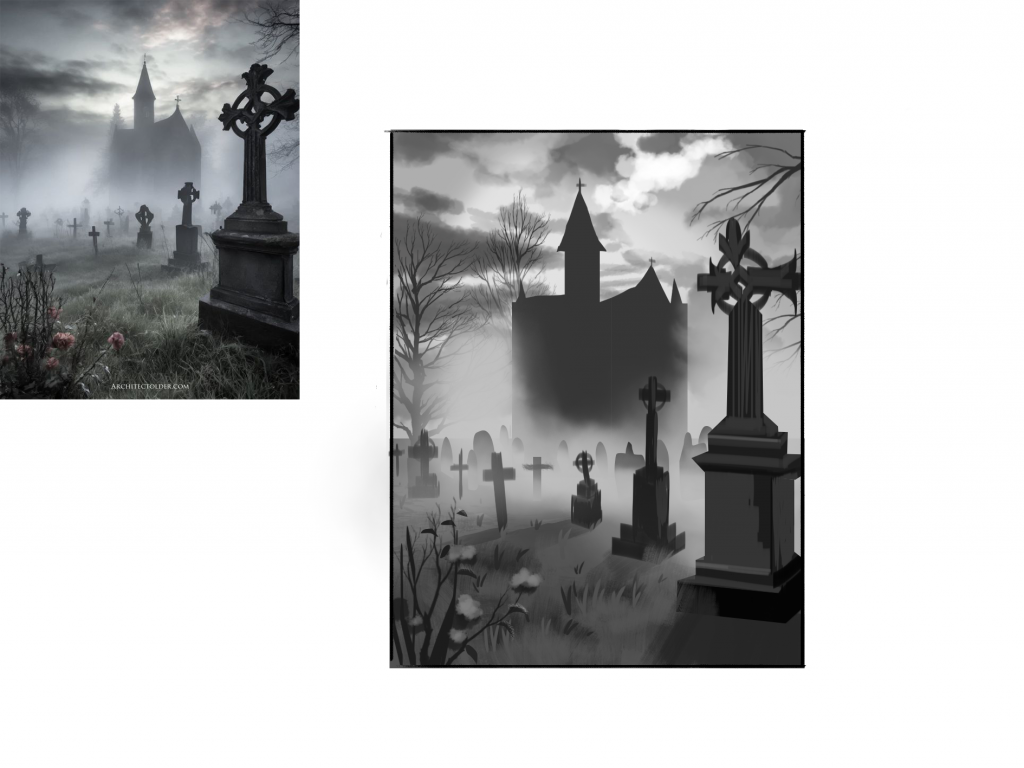
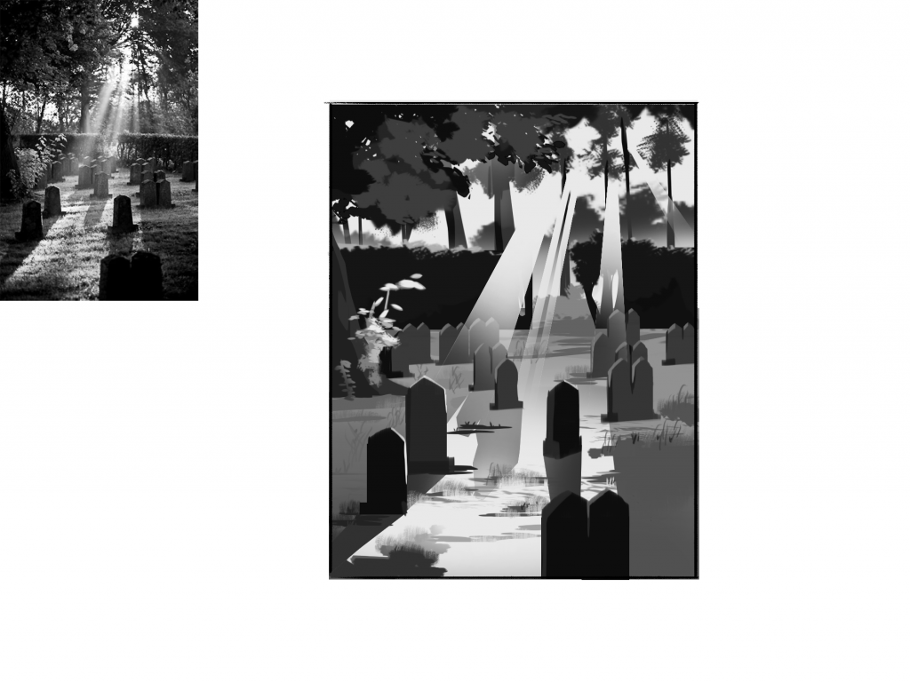
I’d say value study was fun yet one of the most important fundamentals in creating concept art. By understanding colour through gray scale/values, I realise how colour is defined by values. Value is responsible for creating depth, lighting, and even shadows.
I collected some photos from Pinterest as references and then analyse their values. As a result, most pictures have lighter values at the back than at the front, because of the atmosphere. Furthermore, light can significantly lighten the value based on how strong the light source is. So as shadows, the brighter the light hits an object, the darker the shadows will be.
Lastly, I noticed that every object has its original values to begin with. Some rocks are lighter than other rocks, some leaves are darker than other leaves.
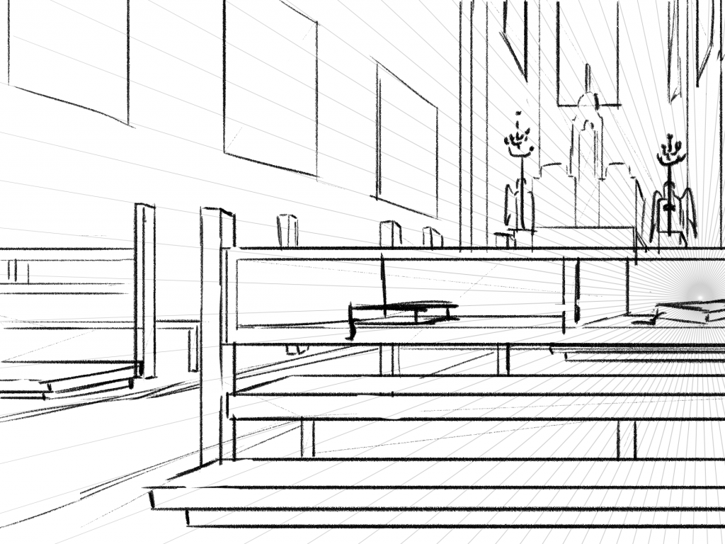
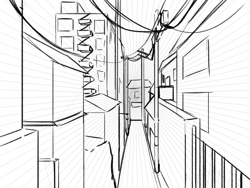
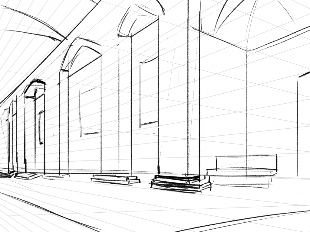
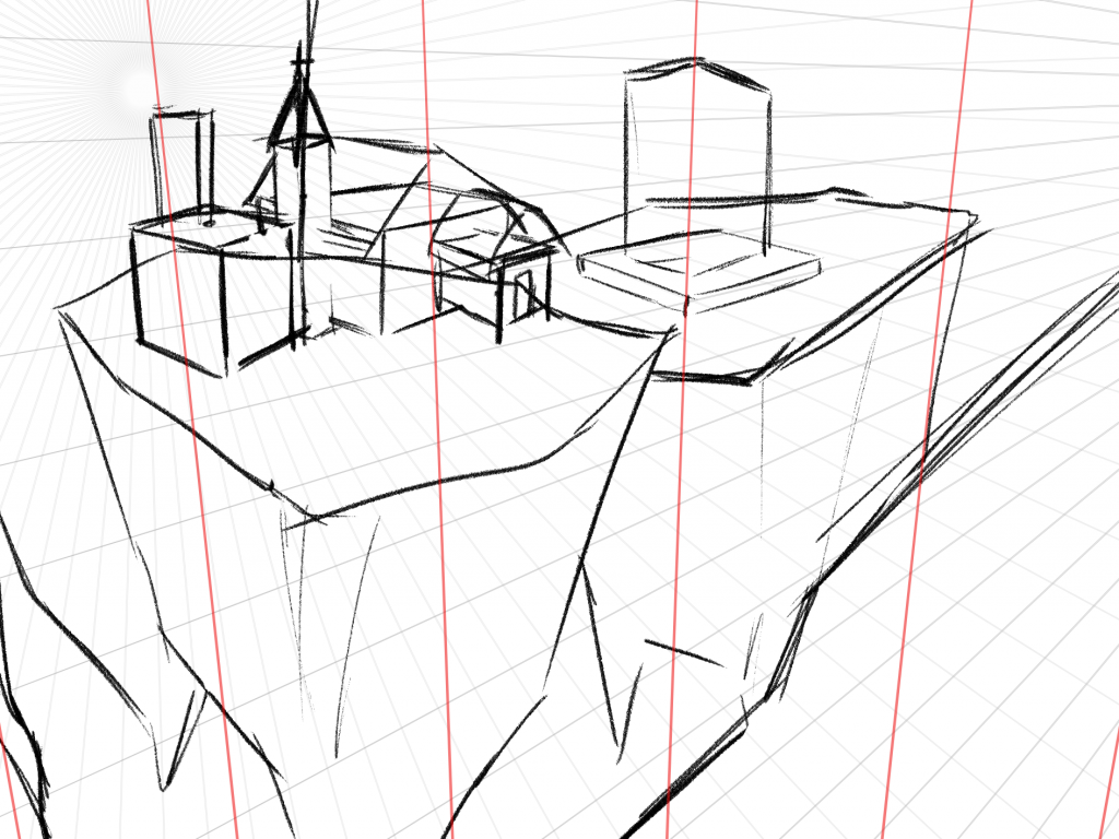
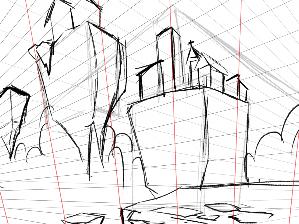
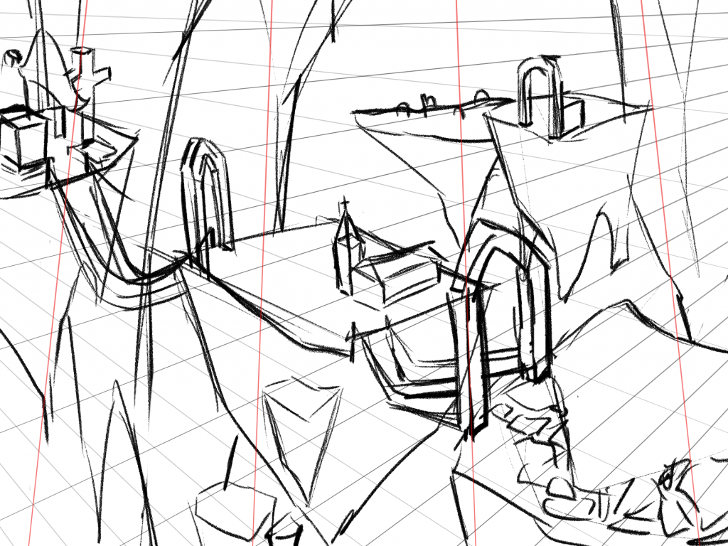
Perspective Practice
The perspective practice helped me create a dynamic environment. As this is one of the keys for capturing the audience’s attention. I learnt various perspective points, from 1 to 3 point perspectives. During my study in 2 and 3 point perspectives, I struggled with placing the objects, hence I used the box method that was introduced in class. By creating boxes as guidelines, I could identify how the objects were placed.
As I got to 3 point perspective, I could see how strong this particular perspective. It creates even more interesting environment. It is as if I’m looking a at a professional cinematic shot. Therefore, I will implement 3 point perspective in my future thumbnails.

Lighting and Colour Study
-
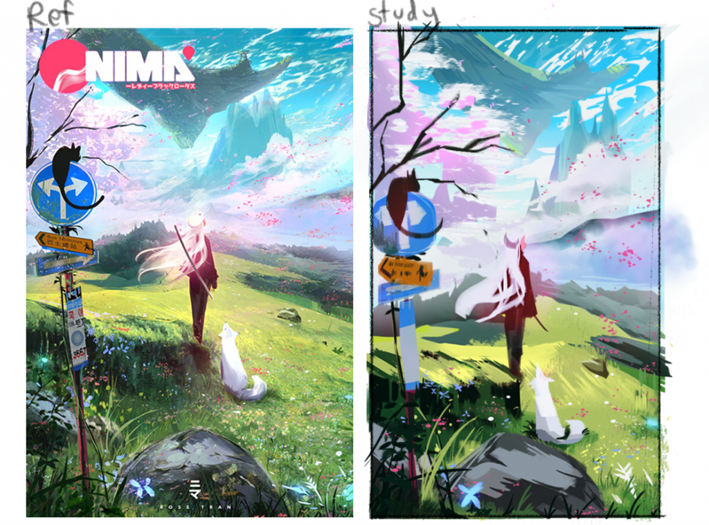
Nima Fields (2022) Lighting and Colour Study
Another study was colour study. I chose some artwork with interesting colour palettes and lighting for analysis. The first artwork I studied was from Ross Tran a.k.a Ross Draws (2022). I admire how he implemented light yet vibrant colours itno his paintings, creating a serene and playful ambiance. Additionally, he frequently used painterly-style brushes to create the environment. This adds personality and detail effortlessly. I experimented using painterly brushes as well and I quite liked it, but I didn’t want to use it too often as it might result in muddiness.
-
As Arcane Season 2 (2021) is nearing, I couldn’t help but study their gorgeous art style. The artist Robin Lhebrard was the one behind this artwork (2021). The set of brushes he used for this piece is significantly different from Tran’s. Its colour is muted, which makes it even more realistic. Another reason why I chose this artwork was because of the fog, as it affects its colours, values, and ambiance. Due to that, I struggled a lot while choosing the right colours, as they seemed to blend with the surrounding even more (for example the leaves on the ground).

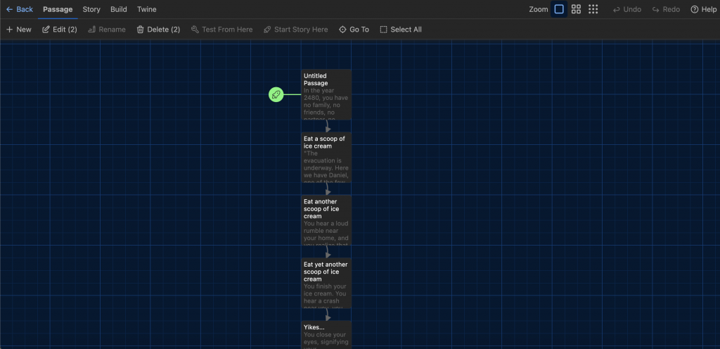
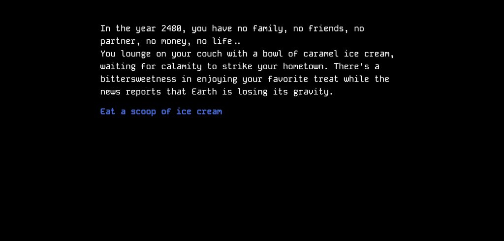
Concept Art Context / Story (Finalised)
During this week’s Introduction to Games Art unit class, we were tasked to create a story in Twine (a text-based game). I took this chance to create a full story of this project and here is the result.
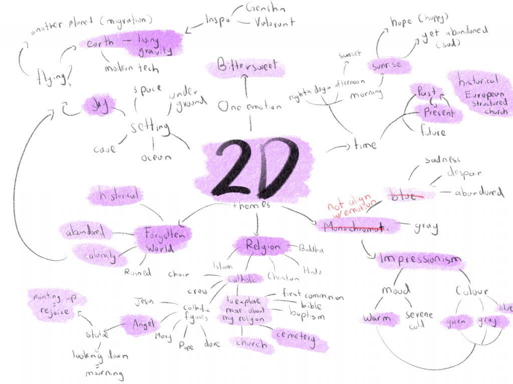
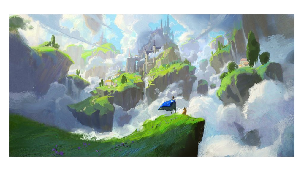
I came up with a title for the concept art as well, ‘Lost’. It represents its whole concept of being lost in the sky. Moreover, to support the bittersweetness, I decided to use the sunrise to support the overall lighting and atmosphere. This decision led me to rethink using the monochromatic style, in the end, I changed my mind to using an impressionism style to support it.
After creating the story through Twine, I refined and finalised the context here.
Mind Map (fixed)
As I decided to change from the monochromatic style to an impressionism style, I updated my mind map.
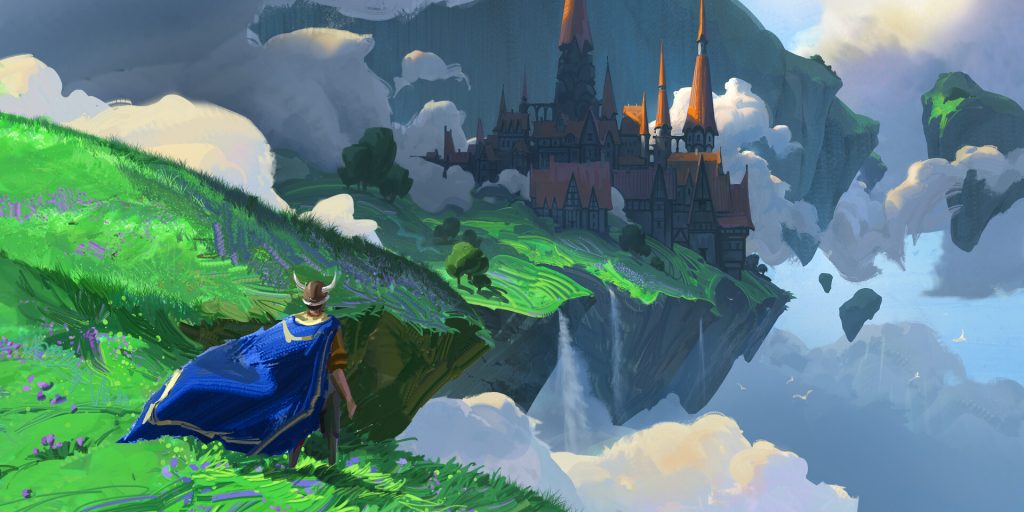
Quentin Mabille is one of the artists who use a vibrant and warm colour palette to create a sense of nostalgia. Their artwork would be the best reference and inspiration for my impressionistic concept art. Especially the artwork shown here which portrays floating islands with the warmth of sunlight hitting the clouds and land. Besides the lighting, the shadow has a much cooler tone as it is missing the warmth from the light. These aspects are important to be remembered while working on colours, as light and shadow tones are opposites.
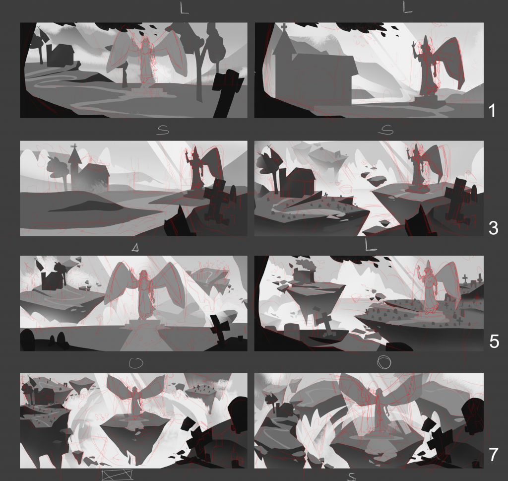
Thumbnails Progress
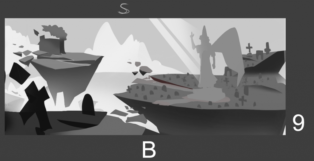
I continued to work on the potential thumbnails that I would use for the outcome. Determined to learn more about compositions, I used even more compositions, like V-arrangement, L-arrangement, circular, and golden triangles compositions. Of all the thumbnails I’ve made, I like the one with circular compositions as it really empowers the statue in the middle, making it the center of attention (as it should). Moreover, strong sunlight hits the statue to strengthen that idea even more.
Angel statue pointing up to the sky to back up the bittersweetness emotion.
Feedback: ‘good work, feedback from today still stands. lean in to your values to reinforce a sense of depths some of the mid far grounds is too strong’ -Luca Risino
(True the value is too strong for something far at the back)
Bibliography
Arcane (2021) directed by: Pascal Charrue Arnaud. Available at: https://www.netflix.com/gb/title/81435684 (Accessed: 19 June 2022).
Lhebrard, R. (2021) ‘ARCANE – Caitlyn’s Flashback’ [Artstation]. 22 December. Available at: https://www.artstation.com/artwork/r9JNdG (Accessed: 20 June 2024).
Mabille, Q. (2024) ‘Old Speed Painting’ [Artstation]. 7 September. Available at: https://www.artstation.com/artwork/4NX3xL (Accessed: 14 October 2024).
Tran, R. (2022) ‘Nima Fields’ [Instagram]. 27 June. Available at: https://www.instagram.com/p/CfUX8G2p5Bo/?igsh=MTQyYmVrc2NsNjR0dQ%3D%3D&img_index=1 (Accessed: 10 February 202).