
3 Nov, 2024 — Donita Kadharusman
Principles of Games Art 24/25
2D — Concept Art, Week 3
Lighting and Colour Study
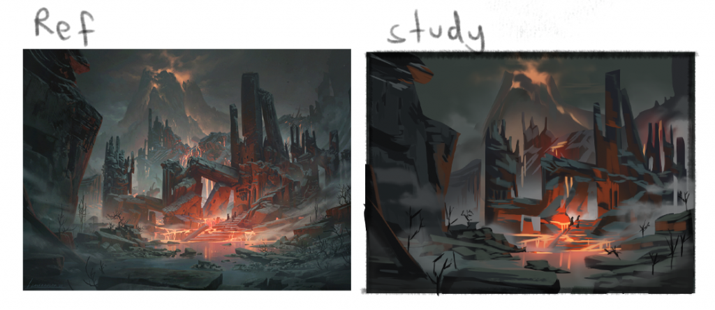
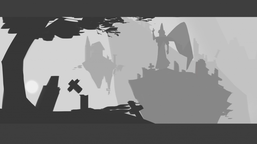
I continued with some more lighting and colour study. This time I chose Lanfranconi’s piece with strong lighting (2023). Yet again, I was able to identify how the tone of the shadows and light source are opposites, indicating the absence of the light’s colour. Moreover, I learnt a new technique of painting by colouring from dark to light and overall shape to details. By using this technique, I realised how much faster the painting process would be.
-
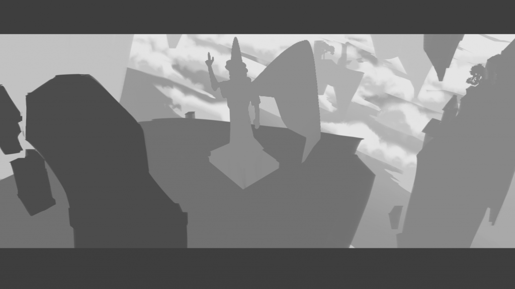
The 4th and final colour study I chose was from Ernault’s artwork (2020). I admire his skill in blending one colour with another, hence I tried testing my own skill. Even if it’s not perfect, it’s definitely a starting point. A point that I noticed was how artists frequently manipulate clouds to avert the audience’s attention to the main focus. And the main focus of this painting is in the bottom right, as the clouds all appear to be going in that direction. I will use this technique on my thumbnails again to ensure the main focus is clear enough.

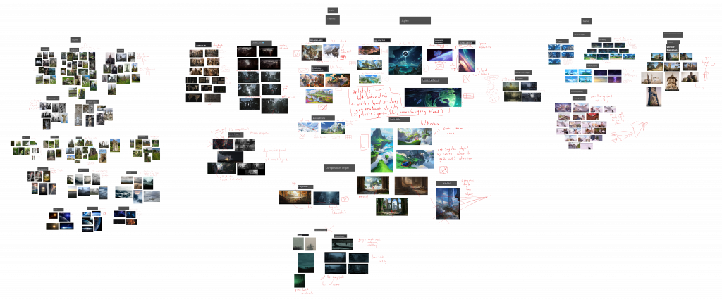
Mood Board Update
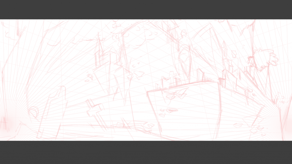
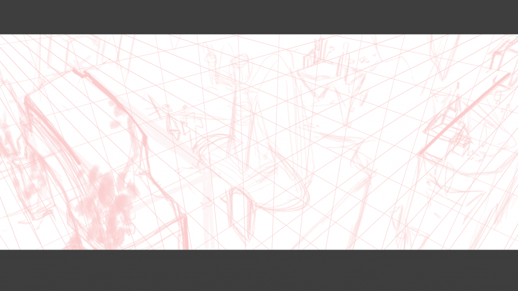
As I decided to change to an impressionist style and create more thumbnails, I updated my mood board. Not only that, I analysed some artworks’ compositions and perspective grids.
Thumbnails Progress
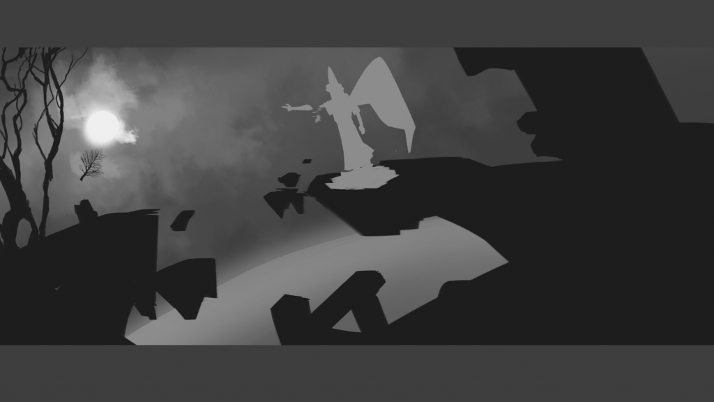
As I felt like time was moving too fast, I decided to try out rendering one of the thumbnails. We were also introduced to photo bashing technique in class, hence I used that to my advantage. I was quite satisfied with the result. I love how photo bashing adds texture and details. But, in the end, there were still some flaws in this piece.
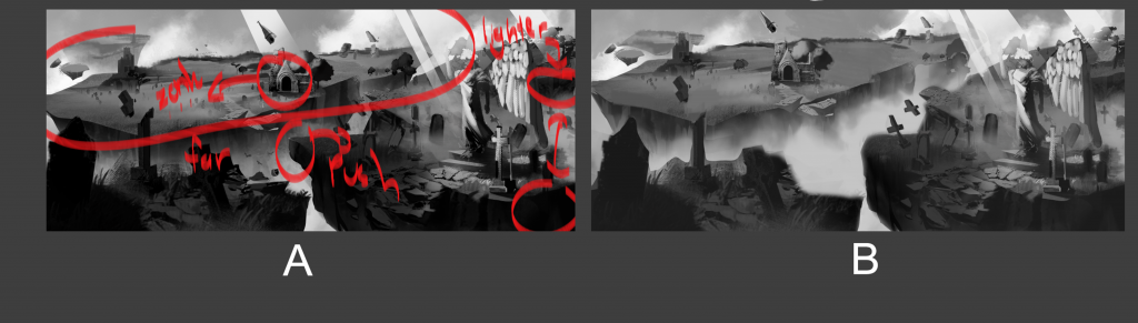
Feedback: The value at the front is too strong. In reality, there is no such thing as pure black or white as there is always light that reflects on objects. Push the island at the back farther so it doesn’t look cramped. -Luca Risino
Just like what he said, creating a pitch-black value eliminates the definition and texture of the object. To remember his feedback, I marked the piece with a red brush. The piece on the right is the fixed version and I could tell how different it looked compared to the first version. It looks more realistic and the first version looks like a photo that has been heavily edited with high contrast.
Despite all the thumbnails I’ve created, I am still not satisfied with them. They still feel flat and uninteresting, possibly because I didn’t put enough effort into making a perspective grid. Moreover, some thumbnails don’t have a clear main focus, even if I intended the statue to be the main focus. Therefore, I will create more thumbnails using perspective grids (preferably 3-point perspective) and make the statue stand out.
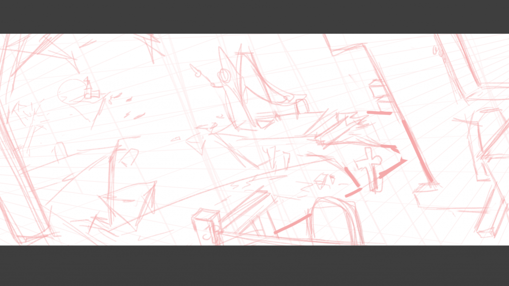
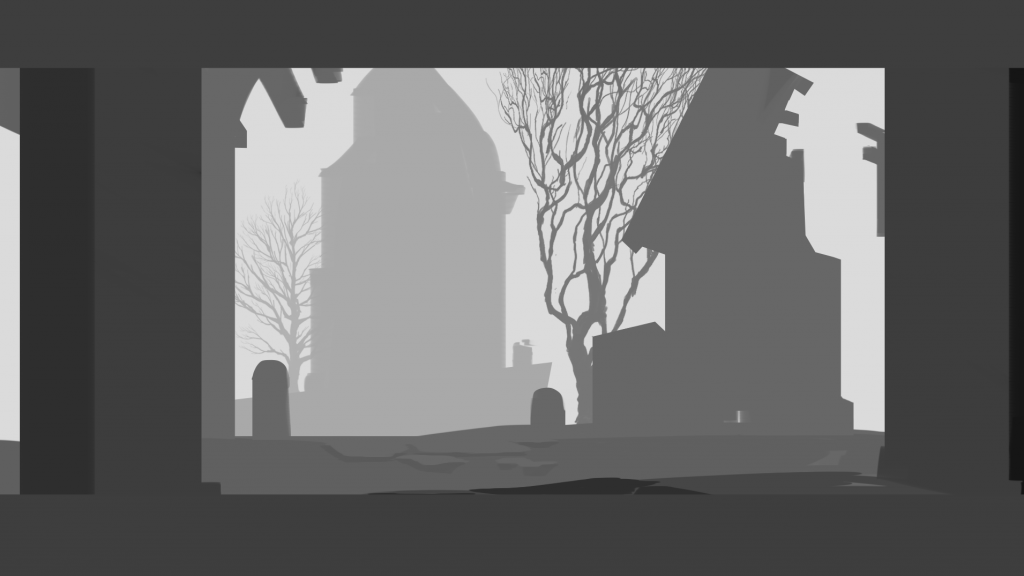
Final Thumbnail Sketches
Learning from my past mistakes, I implemented perspective grid first then proceeded with sketching, while also keeping in mind what compositions I was using. Even if it’s out of my comfort zone, the results didn’t lie.

Looking back at my mood board, I added outer space artwork that I found absolutely mesmerising so I went out of my way a little bit and created an outer space scene. I thought it would be fun to experiment with lights and shadows as the outer space is a darker environment than earth.
Moreover, my aim is to make the statue look powerful and bold, hence I put the statue in a position where the surrounding and background are less distracting.
Feedback: Add lens flare to the outer space scene to create dramatic lighting. -Luca Risino
Bibliography
Ernault, G. (2020) ‘Valorant- Ascent Skybox’ [Artstation]. 2 July. Available at: https://www.artstation.com/artwork/YeeOgV (Accessed: 28 October 2024).
Lanfranconi, L. (2023) ‘Crumbling Necropolis’ [Artstation]. 14 June. Available at: https://www.artstation.com/artwork/VJ2wyR (Accessed: 27 October 2024).