10 Nov, 2024 — Donita Kadharusman
Principles of Games Art 24/25
2D — Concept Art, Week 4
Colour Study with Ball Method
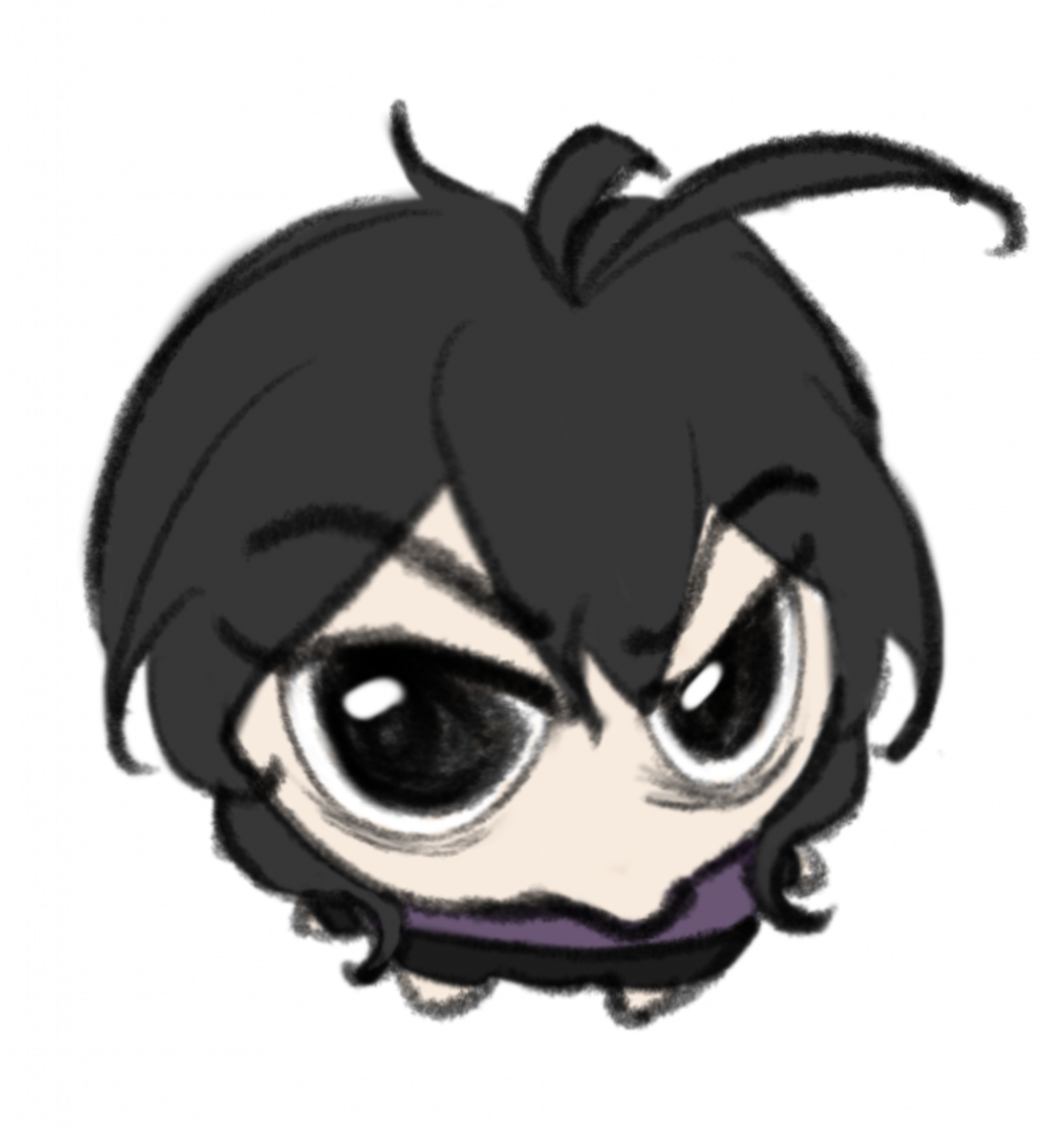
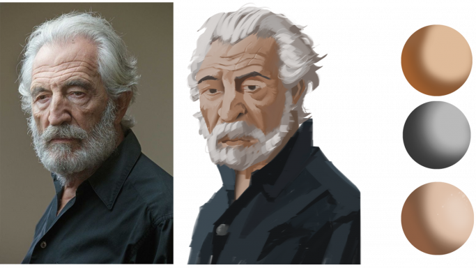
I started this week with another colour study using the ball method. This is the first time I understand the purpose of this ball. It can help justify the light, shadows, and reflective light of the element before colouring the element itself. I then applied these colours to the portrait I painted.
Peer review: My friend, YC suggested to make the eyes smaller as they seem unrealistic.
Now that I see the result, she was right. Another thing that I noticed is that the structure of his face is not entirely proportional. Hence, I will first learn anatomy to gain a better understanding of the human body and then draw it in my own style while also making it anatomically correct.
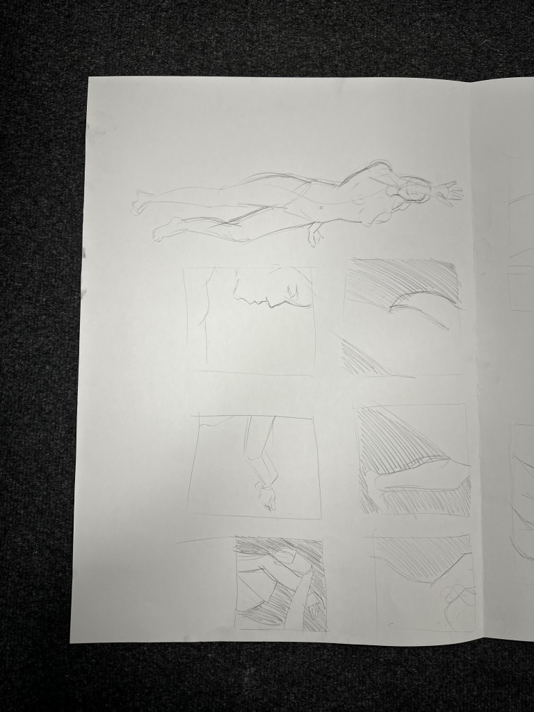
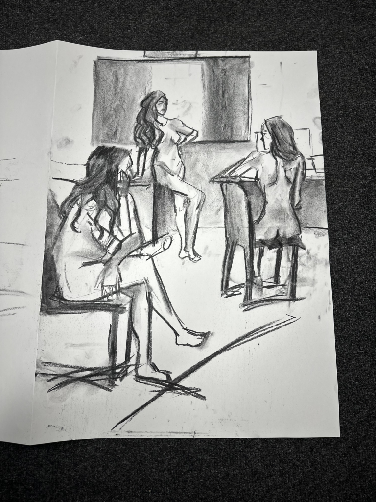
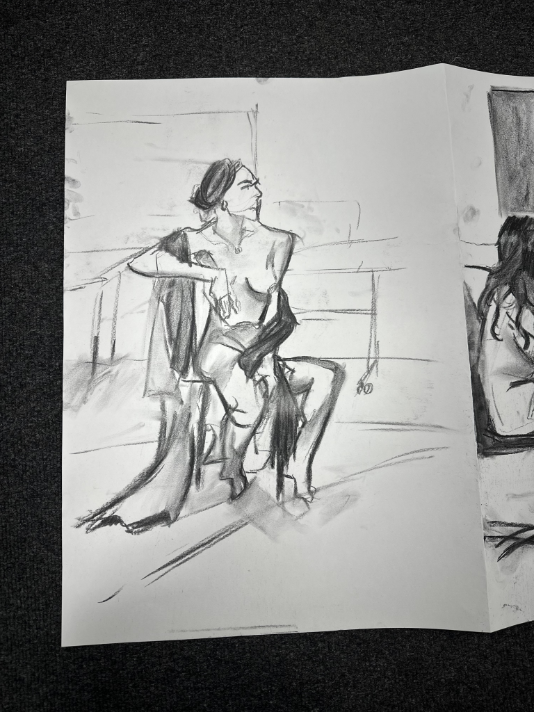
Life Drawing
Life drawing session was experimental. I was handed a charcoal to try, although it was messy, but I found it fun. With charcoal, I could draw bold lines that were used as guidelines. Moreover, life drawing also enhanced my observational skills as I had to constantly look at someone in 3D not in a picture. The difference is when looking at the picture, the object will not move even if I look at a different angle. But when it is in real life, angles play a huge role.
Feedback on charcoal drawing: It needs something that can harmonise the whole drawing
I was confused at first when the tutor mentioned it. But, after analysing her words I realised she was talking about mark-making—a technique that is repeated to unify the piece. Then I understood how this approach can benefit the artwork by adding a unique mark that differentiates every artist.
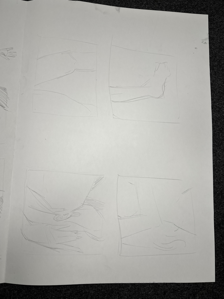
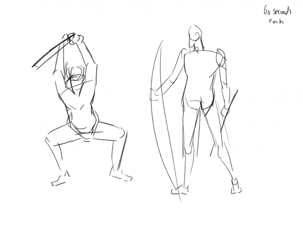
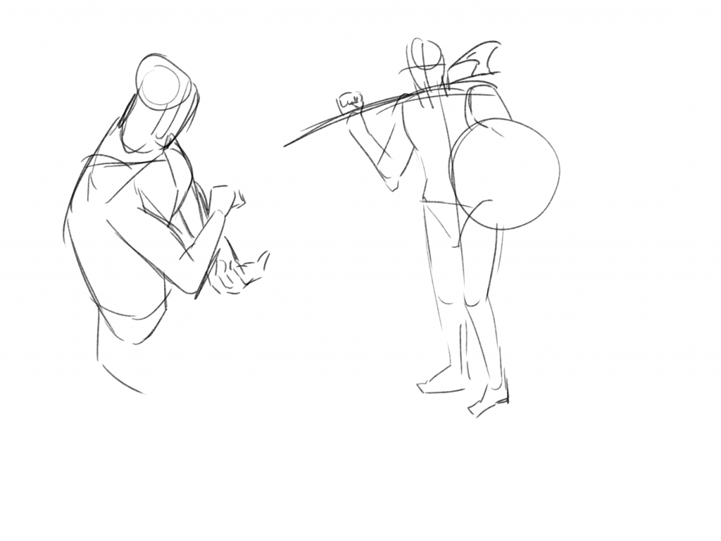
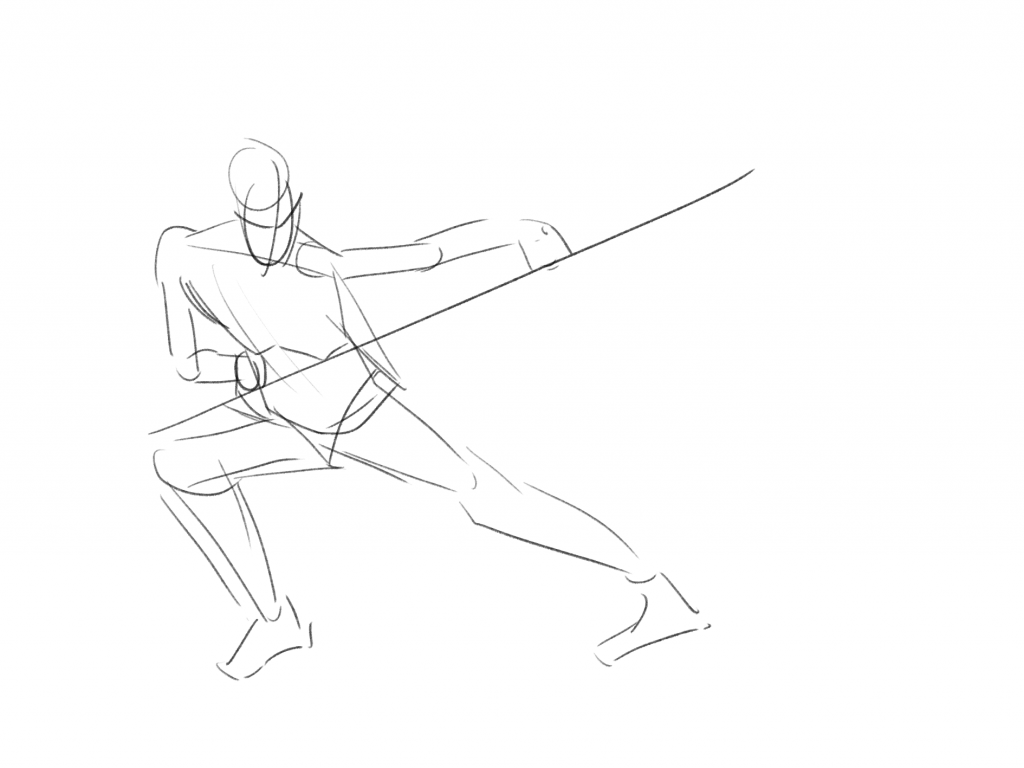
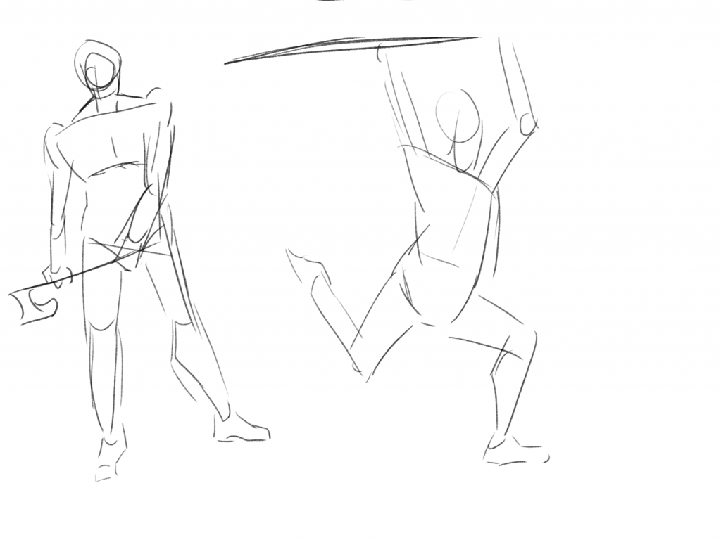
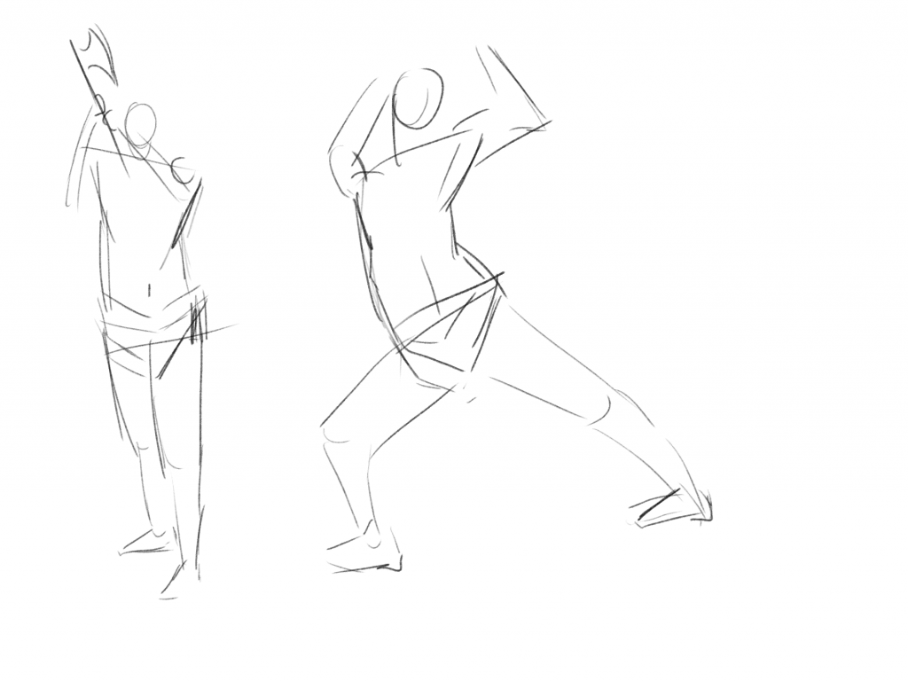
Quick Poses Sketches
Joshua suggested that we warm up before starting the session. He introduced us to the Quick Poses website, which provides poses with a time limit. We were tasked to sketch every pose in just 60 seconds. At first, I was shocked at how short 60 seconds was, and the results were terrifyingly bad. However, I reminded myself that this was just a warm-up, it was meant to prepare us for the day, not to achieve perfection.
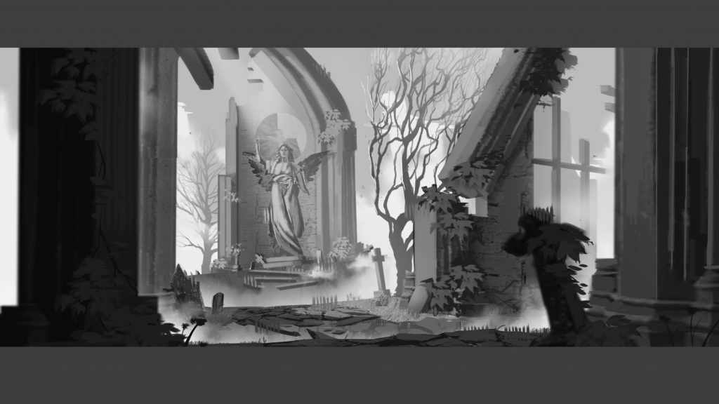
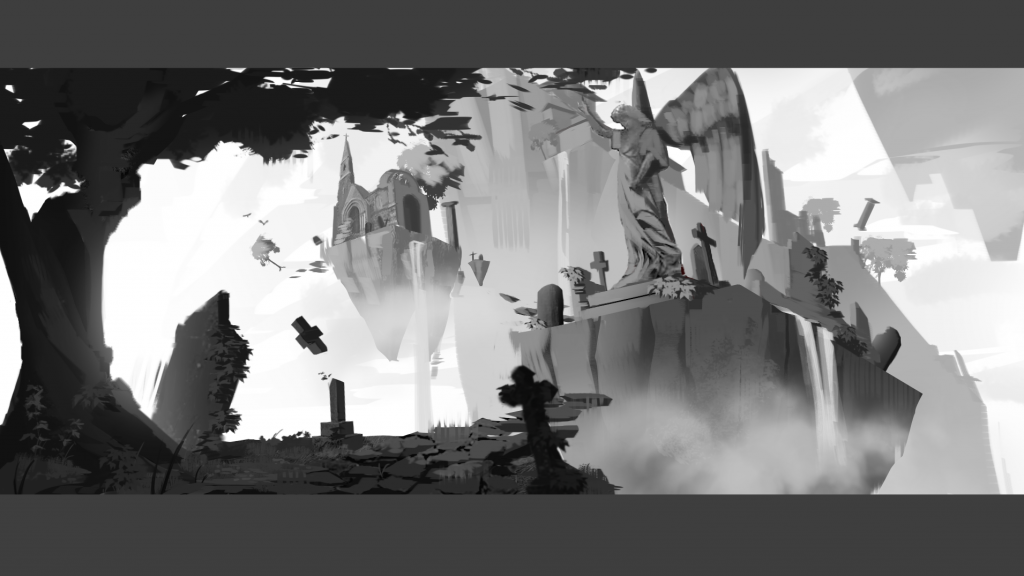
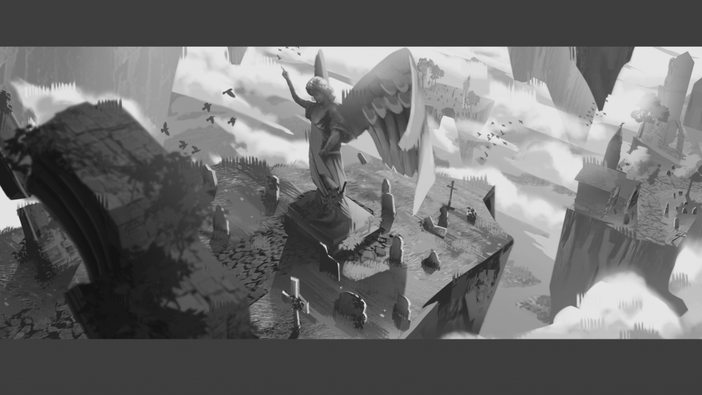
Final Thumbnails
Just as week 4 was ending, I managed to complete rendering my final thumbnails. Although photo bashing helped in rendering these thumbnails, I also had to remind myself that everything has its original value. The closer their values are, the harder it is to define what they are. Even if it sounds negative, it could be used as an advantage. The farther the objects are, the more unreadable they get. This can also avert the audience’s attention to the foreground rather than the background.
While rendering, I remembered the artists’ I had taken reference from painted loosely, yet the paintings were still clear. Hence, I tried painting the entire picture first then focus on the details.
Moreover, I found an interesting brush which resembles a huge chunk of grass. Remembering my life drawing lesson, I could use this brush as my mark making.
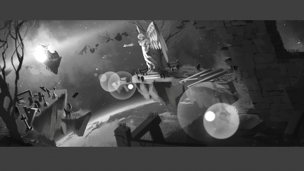
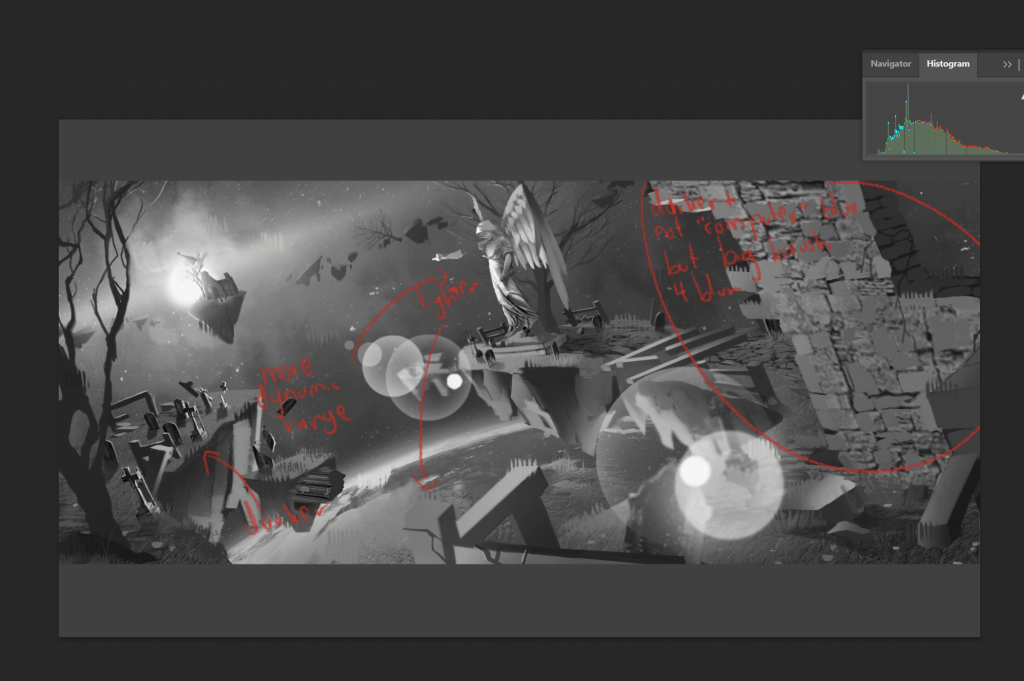
Feedback: Histogram to check the overall values. -Joshua
Feedback 1: Foreground needs to be darker and less computer blurry. Stronger values in shadows and light. -Joshua
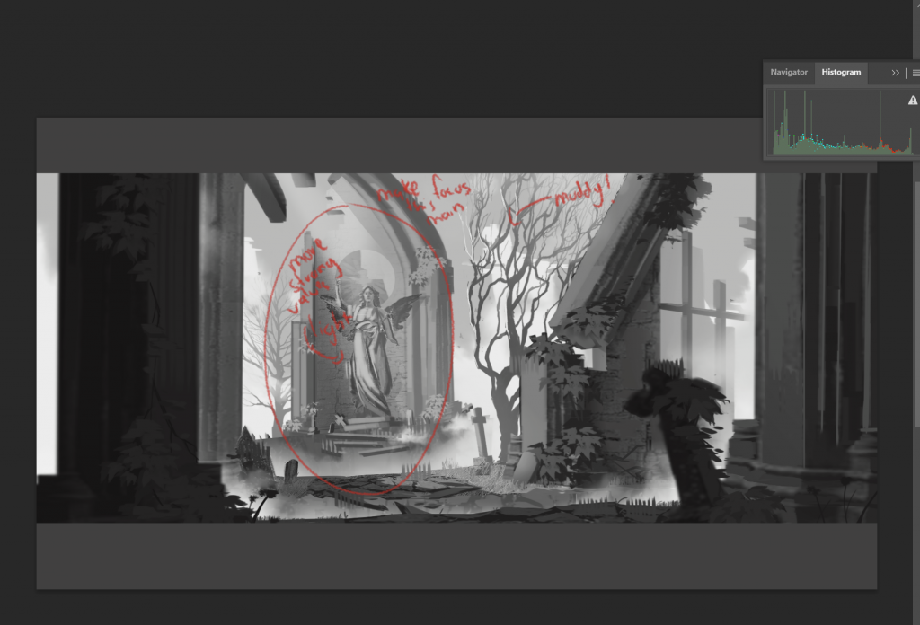
Feedback 2: Lighting and atmosphere blur on tree makes tree blurry. Again stronger values on the statue to make it as the main focus. -Joshua
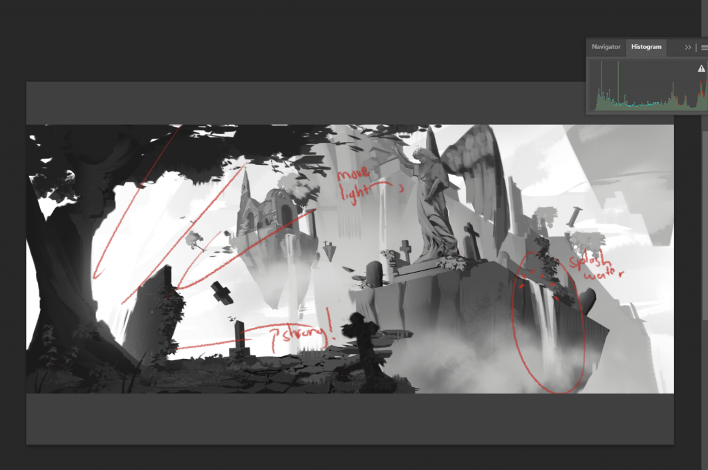
Feedback 3: Add splash of water at waterfall. Stronger values on foreground and light on statue. -Joshua
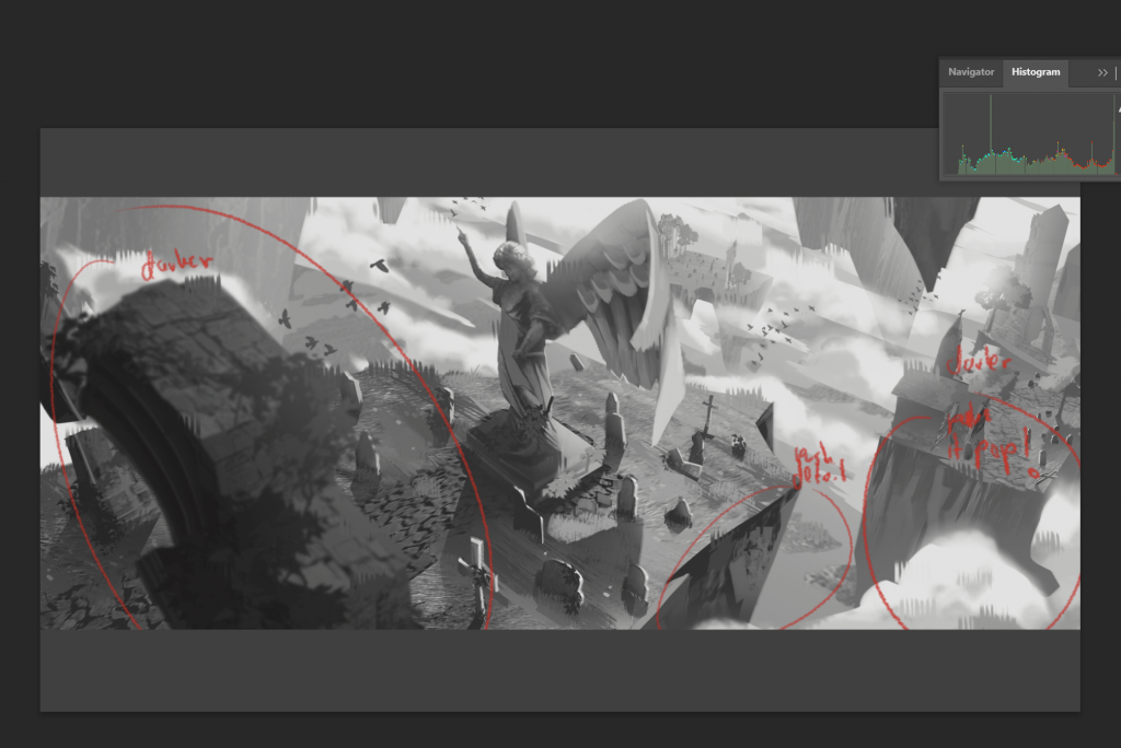
Feedback 4: A lot of mid-tone, darker on objects closer to screen, stronger values on the second island. -Joshua
I love getting feedback. As I spent developing each piece for quite a while, the errors that I made slowly blended in with the whole piece. But when someone looked at it for the first time, they would almost instantly recognise the flaw (also because they’re professionals).
Moreover, I discovered a new feature, histogram. It is a tool to check values, where the left side represents the dark values, and right side represents the lighter values. I noticed most of my thumbnails reside more in the middle, meaning there are a lot of mid-tones than strong values. This can cause the coloured piece to look bland and blend too much with its surrounding. I will fix these issues with bolder dark and light values, while also using the ‘levels’ layer to make adjusting values easier.